Oct 18, 2026
How Should Weathering Be Reviewed on a Collectible Paint Sample?
Review collectible weathering paint samples for wear placement, scale, material differences, sheen and the distinction between intentional effects and defects.
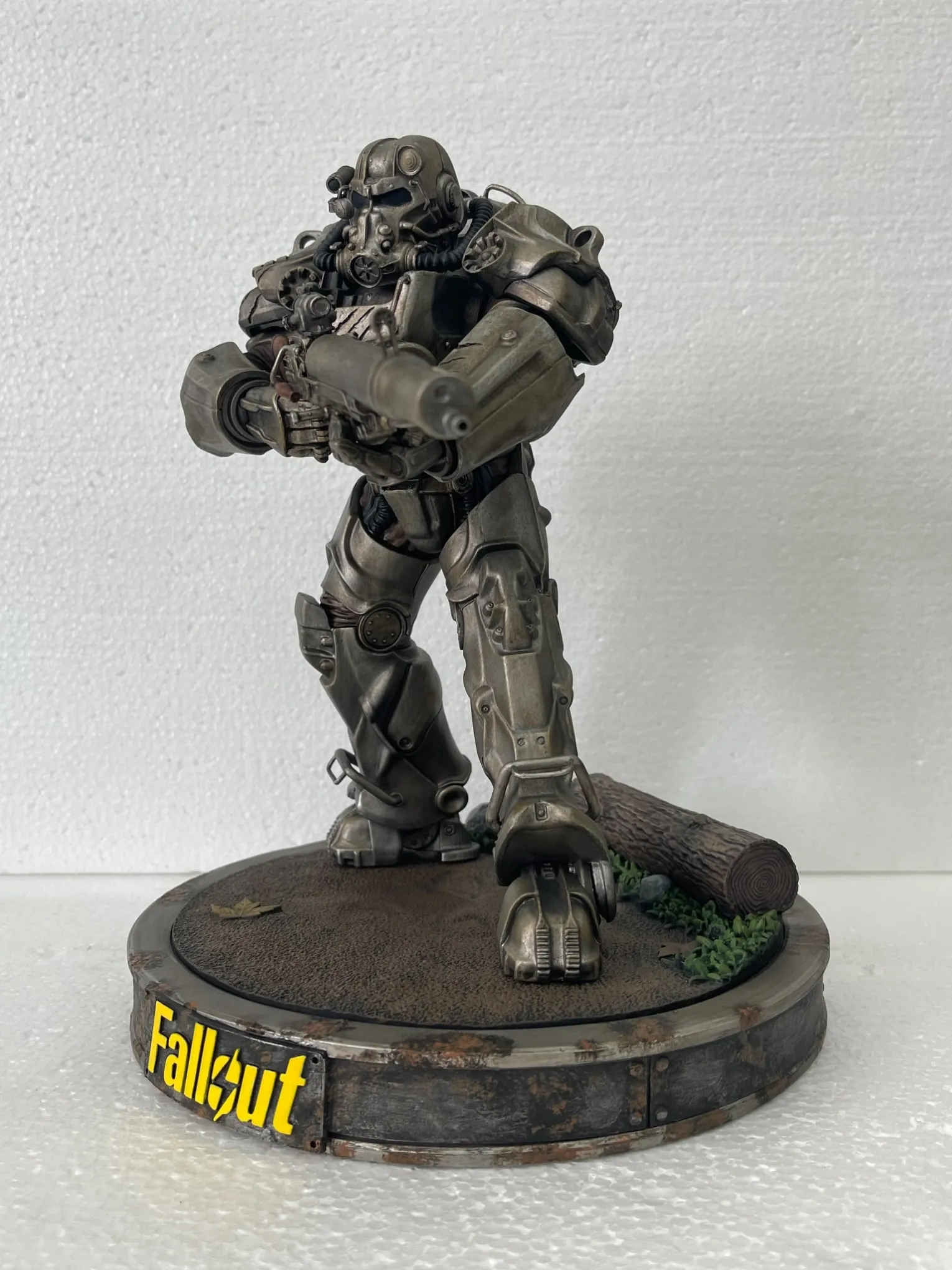
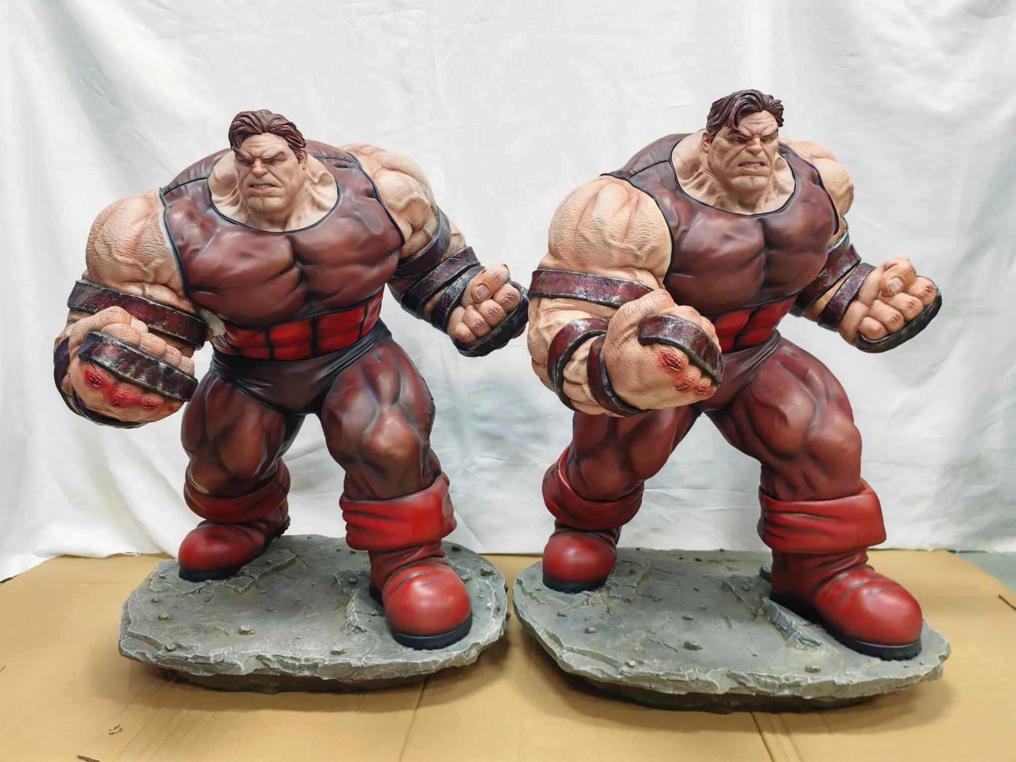
Review weathering on a collectible paint sample by checking where wear belongs, how large and intense the marks appear at the intended scale, and whether the effects preserve the sculpt and material differences. Approve the final appearance under agreed viewing conditions, not just an instruction to make the product look older or dirtier.
Weathering is an intentional finish. It should communicate use, age or environment without becoming a way to excuse coating defects. For product teams, the useful approval question is not “Is there enough weathering?” but “Does each effect support the intended design?”
Define the wear story before judging the paint
Agree what the object represents: maintained equipment with localized wear, long-neglected armor, dusty clothing or a damaged prop. These are different directions, even if all use dark washes and pale highlights.
Mark the areas that should stay comparatively clean, the exposed edges that may show wear, and the recesses where dirt is intended to collect. Include the base and accessories in this review. A heavily aged figure on an untouched scenic base may be deliberate, but it should be a conscious choice.
Avoid asking for every surface to receive the same treatment. Uniform distress can flatten the visual hierarchy and make different materials look alike.
Check the size and placement of the marks
Examine the sample both at normal display distance and close enough to see individual effects. A scratch that looks delicate in a large photograph may dominate a small component in person.
Compare the width, density and contrast of chips with nearby sculpted features. Review whether marks cluster around plausible contact areas or simply outline every edge. Repeated, evenly spaced patches can look decorative rather than irregular.
Use several views. A convincing front can hide an abrupt stop along the side of a panel or an excessively clean rear surface. The aim is a coherent finish around the object, not identical decoration on all sides.
Keep material differences and focal details readable
Painted metal, bare metal, leather, fabric and stone should not automatically share one weathering recipe. Define the represented material first; the collectible's actual manufacturing material may be resin or plastic.
For example, a pale edge on an armored plate might suggest worn coating or reflected light. The same continuous pale line on fabric may read as an artificial border. Dark deposits can suggest accumulated dirt in a recess, but excessive coverage can obscure stitching, engraving or surface texture.
Protect the focal areas. Faces, insignia-like sculpted details and important color breaks need deliberate treatment rather than an indiscriminate overall wash. Mancheng's collectible manufacturing capabilities include painting and finishing across resin, PVC/ABS and mixed-material products; the intended surface appearance still needs a project-specific reference.
Judge the finish after the final surface treatment
Review the approved combination of color and sheen. A glossy dark patch may suggest oil, while the same tone in a matte finish may read as dust. An overall protective finish can change the relationship between those areas.
Inspect the sample in consistent lighting and at repeatable viewing angles. Photographs help locate comments, but changing exposure, reflections or screen settings can make an effect appear stronger or weaker.
Record the sample revision and whether the shown surface treatment is final. Do not approve an intermediate stage on the assumption that a later coating will correct the appearance.
Separate simulated damage from real defects
Agree which marks are intentional. A painted chip effect should have a defined visual reference; loose coating, an unintended scratch, a casting seam or handling damage is not automatically acceptable because the design is weathered.
Where a questionable area appears, identify its location and compare it with the intended finish. Ask whether the mark belongs to the artwork or indicates a surface or coating problem requiring investigation. Appearance approval does not replace appropriate finish checks.
The development and production process should keep these decisions separate: what the product is meant to look like, and whether its actual surface is sound.
Turn review comments into usable decisions
Replace “more realistic” with a location and a change: reduce contrast on the shoulder edges, keep the face cleaner, or soften the transition between dust and the underlying color.
Identify effects that must remain recognizable and areas where small hand-applied differences are acceptable. Exact duplication of every irregular mark is a different requirement from matching the overall amount and distribution of wear.
Keep annotated views with the physical reference. Teams can send Mancheng their finish references so sculpted detail, material appearance and approval expectations can be reviewed together.
Frequently asked questions
Should every scratch match the sample exactly?
Only if that is an explicit design requirement. Otherwise define the important locations, visual intensity and permitted variation rather than leaving “random” undefined.
Can weathering hide a casting seam?
It should not substitute for agreed surface preparation. A seam and an intentional painted wear effect are different conditions.
Is a close-up photograph enough for approval?
No. Use close-ups for detail comments and review the complete sample at display distance under consistent lighting before approving the overall effect.