Oct 29, 2026
How Comic-Style Painting Brings a 2D Look to a Collectible Statue
Explore how comic-style painting uses outlines, hard-edged shadows and controlled contrast to bring an illustrated look to three-dimensional collectible statues.
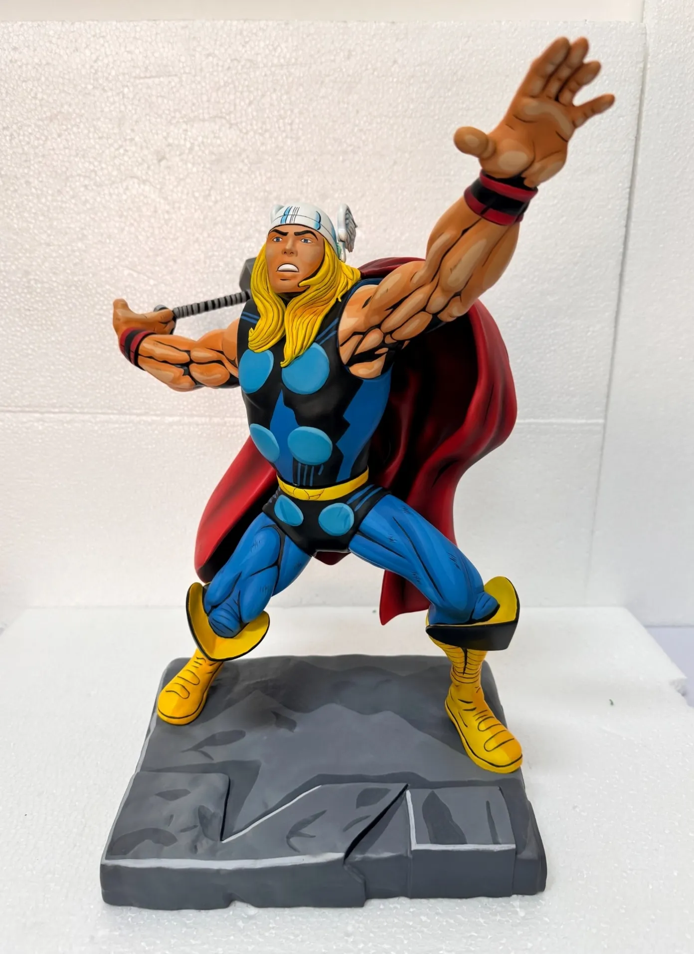
Comic-style painting gives a collectible statue a two-dimensional look by placing drawn outlines, distinct shadow shapes and selected highlights onto a three-dimensional sculpt. The effect depends on where those marks sit as much as on the colors themselves. A sharp black line can clarify a muscle or fold; placed differently, it can make the same form look broken or flat in the wrong way.
For a product-development team, the brief therefore needs more than “make it look like the artwork.” It needs a deliberate relationship between the reference drawing, the sculpt and the angles from which the finished piece will be seen.
Build the effect from shapes, not extra detail
The finished statue photograph accompanying this article shows the approach clearly: light and dark skin-colored patches describe the arms, black marks emphasize selected contours, and broad blue, yellow and red areas keep the overall silhouette readable. These are painted graphic decisions on a physical object.
More lines would not necessarily improve that effect. Dense marks can compete with the expression or make small areas appear dirty. An outline around every sculpted edge can give minor details the same visual weight as the face, hands and main gesture.
Decide which forms carry the character of the piece. Establish the main color fields and shadow shapes first, then use linework to reinforce the intended reading. Fine hatching should have a defined role rather than becoming a general instruction to add complexity.
Decide how the painted light behaves
Separate painted shadows from room lighting
A dark painted patch stays in place when the statue moves; a shadow cast by a lamp changes. Comic-style finishes use that difference deliberately. The painted shadow is part of the visual design, rather than a literal record of whatever light happens to fall on the sample.
Agree a coherent direction and degree of stylization. A pronounced graphic shadow can make the intended view strong, but it may appear less natural from another angle. Softer contrast can be more forgiving while weakening the illustrated effect. Neither choice can be approved from a color swatch alone.
Review the turn, not just the front
A development video reviewed for this article shows a hand turning a partially painted sculpted limb. It is useful evidence of how separated light and dark areas wrap around a curved surface. It does not show paint being applied or establish the exact application method.
A similar multi-angle review should ask whether a shadow shape ends intentionally, whether it becomes an unexplained stripe from the side, and whether neighboring shapes still describe the underlying form. Give particular attention to the shoulder, elbow and other changes in direction.
Set the line language at the actual product size
Line thickness, taper and placement influence expression and anatomy. A small shift near an eye or mouth can change the character's expression; a heavy mark across a joint can suggest an unintended division.
Review the physical sample at normal display distance before enlarging close-up photographs. Magnification helps locate execution problems, but the overall graphic balance must work at the finished size. Approve examples of the intended line character: where it should taper, where it should remain bold and where the sculpt should carry the shape without an added outline.
Avoid assuming that every line must be mechanically identical. A controlled hand-drawn appearance can include deliberate variation. The reference should distinguish that variation from misplaced marks, paint build-up or accidental gaps.
Keep the graphic design continuous through assembly
An isolated painted arm can look convincing while meeting the torso at an awkward change in tone or line direction. Review the assembled piece with its cape, accessories and base, where applicable. Check how adjacent painted forms read together and which marks disappear behind other parts.
The working references should show accessible painting views as well as the assembled result. If a line or shadow must continue across a connection, define how the two sides meet. Where exact continuity would be difficult to repeat, reconsider the boundary during development and production planning.
Surface sheen also matters. A strong reflection can obscure a painted shadow or interrupt a large flat color area. Assess the intended final coating on the actual sample; do not assume that the uncoated appearance will remain unchanged.
Approve a visual system that can be repeated
Retain a physical finish reference and clear views of the important shadow shapes, line endings and assembled transitions. Mark which graphic boundaries are critical to expression or silhouette. Review proposed corrections against the whole piece so that a local improvement does not alter the established style.
For statues, busts and figures, this finish is an interpretation of artwork through sculpt and paint. A useful approval makes that interpretation explicit: what must remain consistent, where intentional variation belongs and how the object should read when someone walks around it. Discussing those decisions before production gives the painting and assembly teams a reference they can actually use.
FAQs
Is comic-style painting the same as realistic shading?
No. It uses deliberately separated graphic shapes and linework. Its painted shadows may remain visibly stylized as the viewing angle and room lighting change.
Can one front photograph approve the finish?
A front view can establish the main composition. Side, rear and assembled views are needed to review how lines and shadow shapes wrap around the sculpt.
Does adding more black linework make the result better?
Not automatically. Line density and weight should support expression, silhouette and form at the actual product size.